
Color combinations play a pivotal role in how we express ourselves through fashion. The right combination can transform your appearance, boost your confidence, and leave a lasting impression. Whether you’re a fashion enthusiast or someone just starting to explore the world of colors and combinations, this blog is your guide to achieving a harmonious and interesting look. Discover the secrets of harmonious and captivating styles.
Understanding the Color Wheel
Understanding the color wheel is fundamental for anyone delving into the realms of art, design, or even basic aesthetics. The color wheel is a visual representation of colors arranged in a circle, showcasing the relationships between primary, secondary, and tertiary colors. This tool serves as a compass for artists and designers, guiding them in creating harmonious and captivating styles. By grasping the principles of the color wheel, individuals can effortlessly navigate through the vast spectrum of hues, unlocking endless possibilities for creative expression.
At the core of the color wheel are primary colors—red, blue, and yellow—considered the building blocks of all other colors. These primary colors blend to form secondary colors, such as purple, green, and orange. Moreover, tertiary colors emerge from mixing a primary color with a neighboring secondary color. Understanding these relationships enables artists and designers to craft compositions that evoke specific emotions or convey particular messages. By employing complementary colors to create contrast or analogous colors to evoke a sense of harmony, creators can weave together visually compelling narratives. Mastery of the color wheel empowers individuals to wield color with precision, transforming their creations into captivating masterpieces that resonate with viewers on a profound level.
The Power of Complementary Colors
The power of complementary colors lies in their ability to create striking contrasts and evoke strong visual impact. Complementary colors are pairs of colors that sit opposite each other on the color wheel, such as red and green, blue and orange, or yellow and purple. When used together, these colors intensify each other, making them appear more vibrant and dynamic. This contrast creates a sense of balance and energy in compositions, making them visually engaging and memorable. By leveraging the power of complementary colors, artists and designers can craft harmonious and captivating styles that leave a lasting impression on viewers.
One of the key aspects of utilizing complementary colors effectively is understanding color theory and its psychological effects. For instance, red and green, being complementary colors, create a strong visual impact due to their stark contrast. Red is associated with passion, energy, and warmth, while green symbolizes nature, tranquility, and growth. When combined, they create a dynamic tension that draws the viewer’s attention and creates a sense of excitement. Similarly, other pairs of complementary colors have their own unique effects, allowing creators to evoke specific emotions or convey particular messages through their artwork or designs. By harnessing the power of complementary colors, artists and designers can elevate their creations, infusing them with depth, vibrancy, and visual allure.
Analogous Color Schemes
Analogous color schemes are a powerful tool in the arsenal of artists and designers seeking to create harmonious and captivating styles. This color scheme revolves around selecting colors that sit adjacent to each other on the color wheel. By choosing colors that share similar undertones and hues, creators can evoke a sense of unity and coherence in their compositions. Analogous color schemes offer a subtle yet effective way to infuse artwork or designs with a sense of balance and tranquility. Whether used in paintings, graphic designs, or interior decor, analogous color schemes lend a soothing and cohesive aesthetic that resonates with viewers on a profound level.
The beauty of analogous color schemes lies in their versatility and ability to evoke various moods and atmospheres. For example, a palette consisting of shades of blue and green can evoke a serene and calming ambiance reminiscent of nature, while hues of orange and red can infuse warmth and energy into a space. By carefully selecting analogous colors and playing with their saturation and value, artists and designers can create compositions that are visually engaging and emotionally resonant. Whether aiming for a subtle and understated look or a bold and vibrant statement, analogous color schemes provide a rich palette of possibilities for crafting captivating and harmonious styles that leave a lasting impression.
Triadic Magic
Triadic magic refers to a color scheme derived from the color wheel, where three colors are evenly spaced apart from each other. This arrangement creates a harmonious balance between the colors while maintaining a vibrant and captivating style. By selecting colors that form a triad on the color wheel, such as red, yellow, and blue, or green, purple, and orange, creators can infuse their artwork or designs with a sense of dynamism and cohesion. Triadic color schemes offer a versatile approach to color composition, allowing artists and designers to experiment with different combinations to achieve a desired aesthetic effect.
The magic of triadic color schemes lies in their ability to create visually appealing contrasts while maintaining overall harmony. By strategically balancing the use of primary, secondary, or tertiary colors, creators can craft compositions that are both striking and well-balanced. Whether employed in painting, graphic design, fashion, or interior decor, triadic color schemes offer a plethora of possibilities for expressing creativity and style. By harnessing the power of triadic magic, artists and designers can elevate their creations, transforming them into captivating masterpieces that captivate and inspire viewers.
Neutral Neutrals
Neutral neutrals refer to a palette composed of subtle, understated colors such as beige, taupe, gray, and ivory. While often overlooked for their lack of vibrancy, neutral neutrals play a crucial role in creating harmonious and captivating styles. These muted tones serve as a versatile backdrop, allowing other elements in a composition to take center stage. Whether used in interior design, fashion, or graphic design, neutral neutrals provide a timeless and sophisticated aesthetic that exudes elegance and refinement.
One of the strengths of neutral neutrals lies in their ability to complement a wide range of colors, textures, and patterns. Their understated nature allows them to seamlessly blend with bolder hues or serve as a calming counterbalance to more vibrant elements. Furthermore, neutral neutrals offer a sense of balance and tranquility, making them particularly well-suited for creating minimalist or Scandinavian-inspired designs. By embracing the versatility of neutral neutrals, creators can achieve a timeless and effortlessly chic style that appeals to a wide audience.
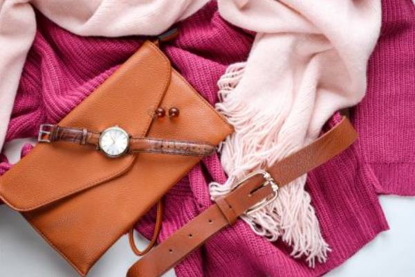
Texture and Proportion Matter
Proportion and texture are essential elements in the realm of design, playing a significant role in creating harmonious and captivating styles. Texture refers to the surface quality of an object, while proportion relates to the relationship between different elements within a composition. By carefully considering texture and proportion, designers can add depth, visual interest, and balance to their creations. For example, incorporating a variety of textures such as rough wood, smooth metal, and plush fabrics can create a rich and tactile experience that engages the senses. Similarly, paying attention to proportion ensures that each element within a design relates harmoniously to the whole, preventing any one component from overwhelming or underwhelming the viewer.
Achieving a successful balance of texture and proportion requires a keen eye for detail and a thoughtful approach to design. Experimenting with different textures and proportions allows designers to create dynamic compositions that evoke specific emotions or convey particular themes. For instance, using proportion to emphasize certain focal points within a space can draw attention and create visual interest. Likewise, layering textures can add complexity and depth to an otherwise simple design, resulting in a more nuanced and visually engaging outcome. By mastering the interplay between texture and proportion, designers can elevate their work, transforming it into compelling and cohesive expressions of style and creativity.
Your Personal Style
Your personal style is a reflection of your unique preferences, personality, and lifestyle. It encompasses the way you dress, decorate your home, and even how you communicate with others. Developing your personal style involves exploring different colors, patterns, textures, and silhouettes to find what resonates with you most. By understanding your preferences and experimenting with various elements, you can cultivate a wardrobe and living space that feels authentic and harmonious to you. Whether your style leans towards minimalistic elegance, eclectic bohemian, or timeless sophistication, the key is to curate a collection of pieces that make you feel confident and comfortable.
Creating a personal style that is both harmonious and captivating involves finding a balance between expressing yourself creatively and maintaining coherence in your overall look. This may involve mixing and matching different pieces to create visually interesting combinations while ensuring they complement each other seamlessly. Additionally, paying attention to details such as accessories, layering, and proportion can elevate your style and add depth to your overall aesthetic. Ultimately, your personal style should be a reflection of who you are, evoking a sense of confidence and authenticity that resonates with those around you.
Experiment and Have Fun
Experimentation and having fun are essential components of discovering your personal style and creating harmonious and captivating looks. Fashion, design, and art are all about self-expression and creativity, and embracing experimentation allows you to push boundaries and explore new ideas. Whether you’re trying out bold color combinations, mixing different patterns, or experimenting with unconventional silhouettes, the process of experimentation opens up a world of possibilities. By stepping out of your comfort zone and trying new things, you can uncover unexpected gems and cultivate a style that is uniquely yours.
Having fun with your style journey not only makes the process enjoyable but also encourages self-discovery and growth. Embrace the freedom to play with textures, proportions, and accessories, allowing your creativity to flourish. Remember that there are no strict rules in fashion and design—what matters most is how you feel in what you wear or how you decorate your space. Let your intuition guide you as you experiment with different looks, and don’t be afraid to make mistakes along the way. Ultimately, the joy of experimentation lies in the journey itself, leading to the discovery of harmonious and captivating styles that reflect your individuality and spark joy in others.
Conclusion
Colors and combinations are your tools for crafting a captivating and harmonious look. By understanding the color wheel, exploring different schemes, and embracing your personal style, you can create outfits that reflect your unique personality. Fashion is not just about wearing clothes; it’s about making a statement. So, go ahead, make yours and enjoy every moment of your stylish journey! Discover the secrets of harmonious and captivating styles.
Fashion Icons and Inspiration: Exploring the Legacy of Style